So it was as I was reading an email I was noticing that a few books that are on my TBR pile that I still need to read recently had cover changes from their hardcover to paperback format and it makes me wonder...why change so soon?
Early Cover Changes
I mean, I get it. It's a marketing thing. But then with the change...I'm thinking it's not all THAT different. So why change? What was "not working" for the first book? I'm just curious really. I mean, yes, we have all dealt with deplorable cover changes mid-series or the dreaded "let's change the cover scheme/look for this GRAND FINALE! Readers won't care!" We've all been there. We've all ranted, rioted, or had our eye just constantly twitch...
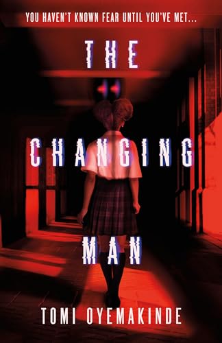
Here's The Changing Man by Tomi Oyemakinde, the left is the hardcover from last year and on the right we have the paperback. So a little different in terms of setting. The font is slightly different in size and style, but still had that squiggly look going on. The girl is still in uniform and we still see a creepy shadow with red eyes. Both are still rather chilling, but I guess, I just don't get why the change? I would think that a new cover look would be more costly to a publisher...but I really don't know. I know cover changes tend to be about drawing in more readers for more $$$ or the previous one feels "outdated," but that's usually from a beloved series from X amount of years ago and is getting revamped. Or some other such fabricated reason. But these have the same themes and feels...so I guess I just don't get it.
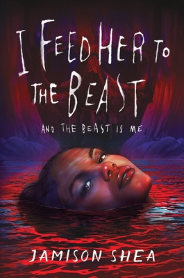
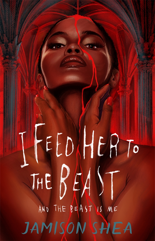
Here's another one that was in the same newsletter! I Feed Her to the Beast and the Beast is Me by Jamison Shea...also on my TBR pile from last year. Another horror themed novel, so the overall "feel" of the covers didn't change so much. Since I still need to read it, perhaps I am missing out on some of the symbolism of the differences here. They are a little alike, a girl is floating in reddish water, not sure if it's blood, it come be since it's horror and you just see her face. Then comes the paperback and we have what still looks like blood dripping all over. Pretty sure it is blood running down her face, but the pillars behind her look bloody. I know, it's red light, but the imagery projects a lot of "bloody" thoughts going on. I almost thought her hair was just a bloody mess, but I am seeing it more as red light behind her. Both are chilling and evoke the right spooky read feel. But again...why the change? The sequel cover fits with the first one I feel like.
I guess I am just baffled with these "early cover changes." Whether there's a sequel or not. What makes a publisher decide a new cover is needed from hardcover to paperback? Is there some sort of copyright happening with the artist? Is that a thing? There are some thing I don't know in regards to the publishing world. This is when I wish we still had the classic RT Booklovers' Convention because I think this would make an interesting panel. Probably more so with publishers than authors, since we know sometimes authors get very little input with their covers.
I guess it just baffles me when a cover gets changed or in these cases "tweaked" so soon. These were debut authors from the looks of Goodreads, so yeah, I guess I am "perplexed" by this.
What's your opinion or stance on these hardcover to paperback changes? I mean, the one is a standalone and the other is a part of a duology, but with the cover schemes both covers for book 1 look fine next to book 2. In that sense...it almost makes you wish publishers could keep the theme the same instead of doing a complete 180 spin on some covers.


No comments:
Post a Comment
Comments are an award all on their own! So my blog is an award free one! Thanks for any consideration though!